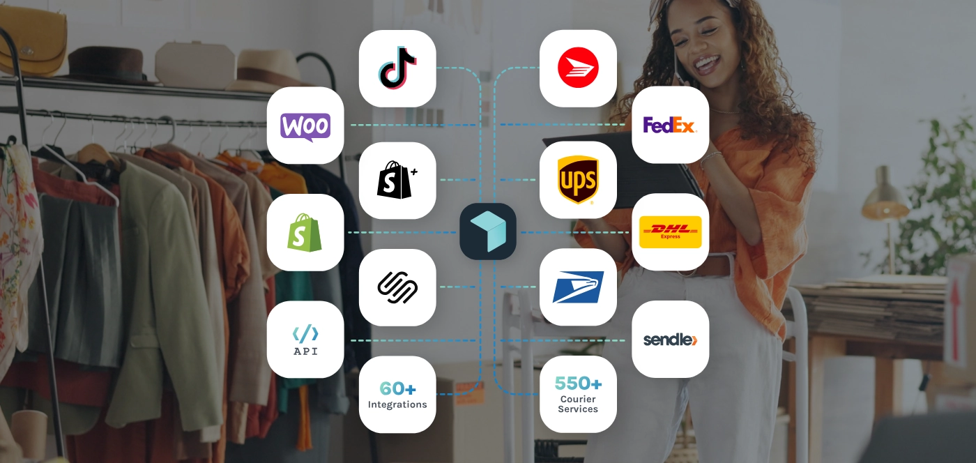
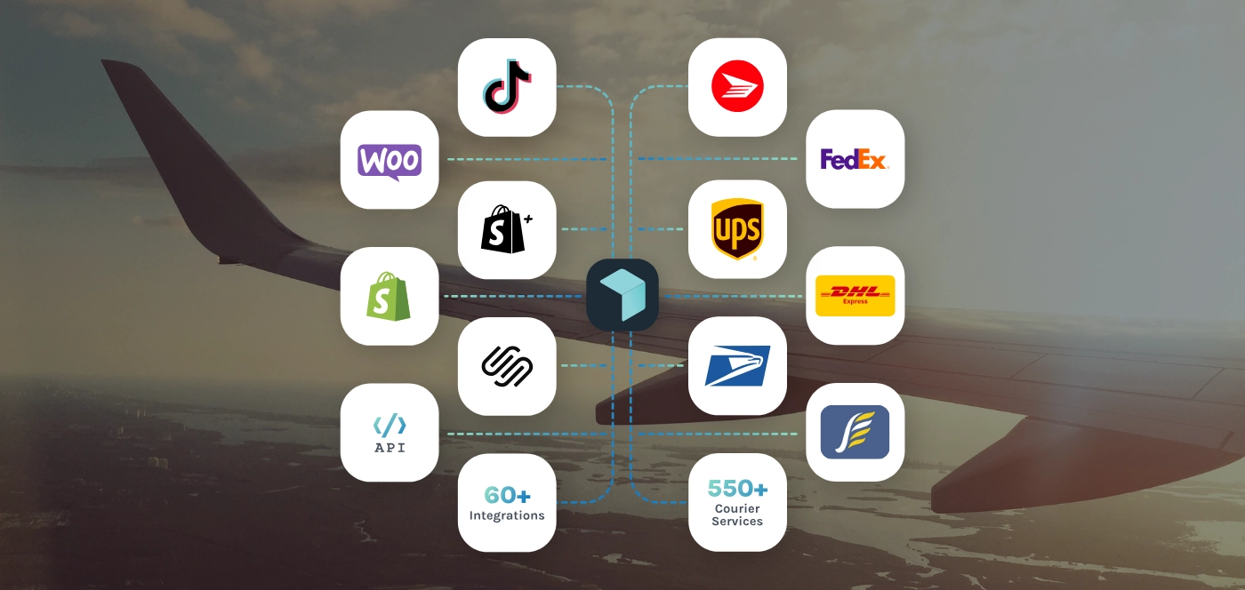
We empower online sellers to ship their products anywhere around the world, at any time. With exclusive rates for leading couriers, on demand pickup requests and a dashboard to monitor all your shipments, we've got your logistics operations completely covered. Get started for free today.
FIND OUT MORE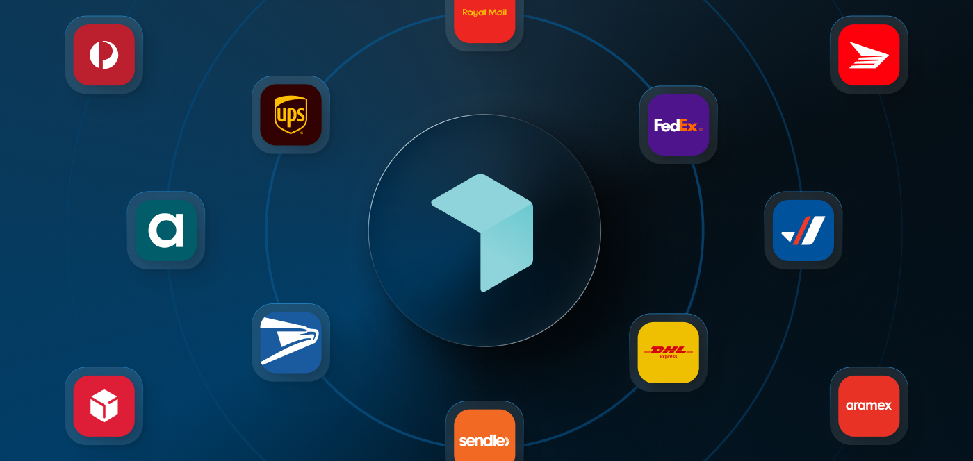
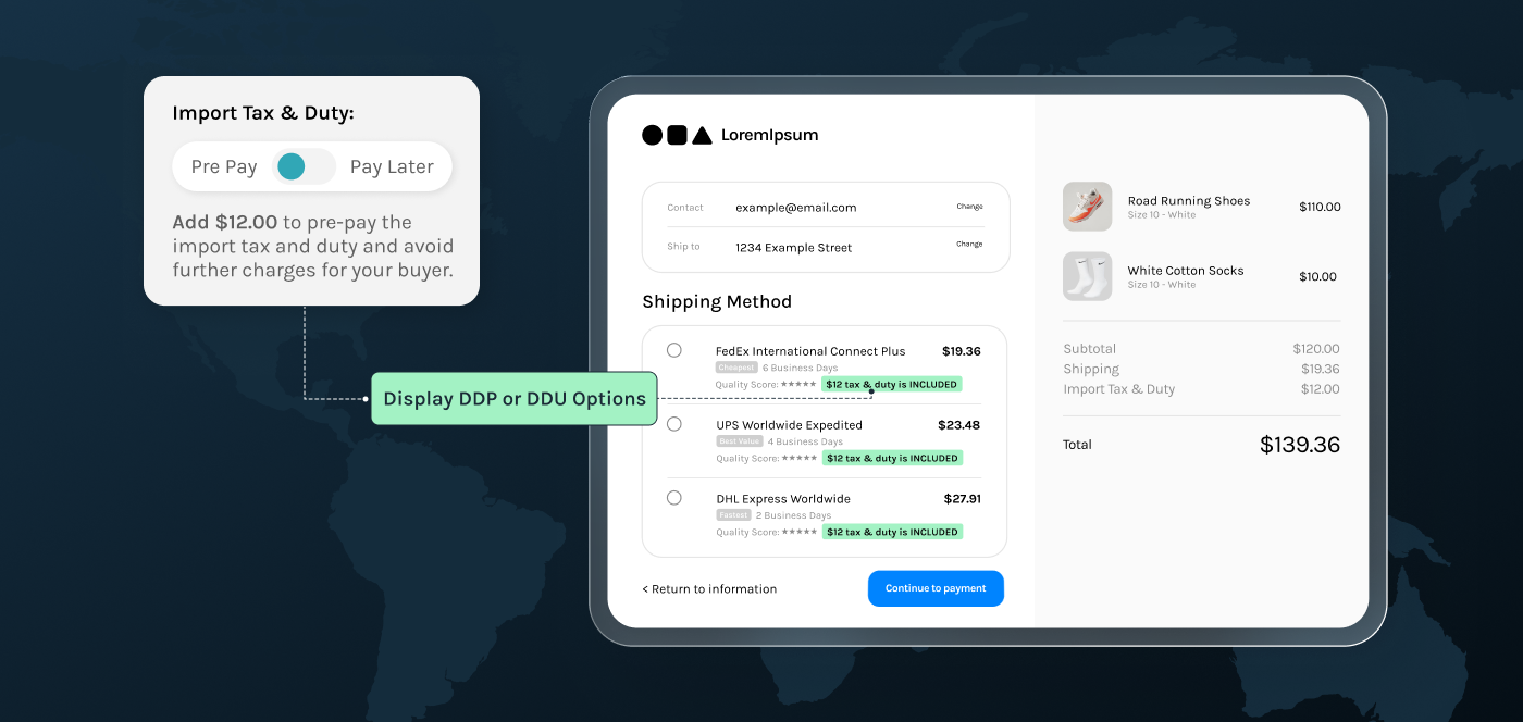
.webp)